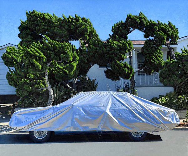
Brian Kaspr is a graphic designer and letterer based in the NYC area. Growing up in Milwaukee solidified his appreciation for traditional American craft and the desire to work with his hands. Attending the Maryland Institute College of Art and working as a design professional focused his early influences into a specific aesthetic style that is artfully cognizant, rooted in traditional quality, and full of character.
Join our mailing list for 10% off
Sign up for our newsletter to get first access to new editions, catch the freshest commentary + features, and snag a special discount.