This store requires javascript to be enabled for some features to work correctly.
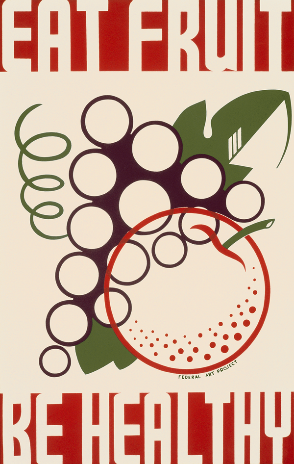
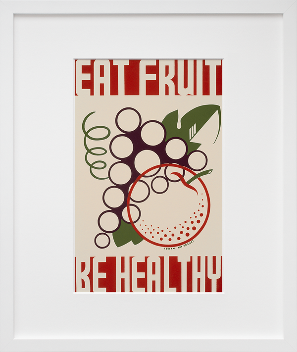
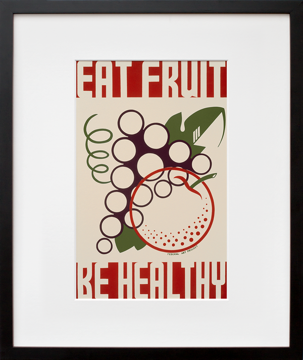
Eat Fruit Be Healthy

  • $85.00

Add Custom Frame

SHIPPING FOR FRAMES ONLY AVAILABLE WITHIN U.S.

Add Custom Frame

SHIPPING FOR FRAMES ONLY AVAILABLE WITHIN U.S.

Add Custom Frame

SHIPPING FOR FRAMES ONLY AVAILABLE WITHIN U.S.

The Works Progress Administration (WPA) was established in 1935 as a government program designed to employ millions of job-seekers for public works projects with a goal of alleviating the economic effects of the Great Depression. Eat Fruit Be Healthy was designed in 1938 as one of more than 30,000 poster designs created by artists working under the Federal Art Project (FAP)—a subset of the WPA—to promote community activities, positive social values and proactive approaches to health. Food and healthy eating became popular subjects for WPA artists and writers as scientists first began to explore the chemical make-up and effects of certain foods in the 1920s and 1930s.


Eat Fruit Be Healthy is a silkscreen print that was produced in the New York City division of the FAP, which provided jobs for over 2,000 unemployed artists at its peak. In the late 1930s, artist Anthony Velonis became head of the FAP’s graphic arts and introduced the studio to silk-screening—prior to his arrival, each poster was painted individually by hand. Silk-screening was inexpensive and allowed printing and designing to be done in the same space, enabling artists to oversee their work from start to finish.

There are stylistic suggestions of the tail end of Bauhaus and hints of art deco-esque elements to be found in this cherry-picked print. The fruit is simplified and stylized, their forms articulated through an expressive collection of graphic lines and shapes. The all-caps, negative-space lettering is bold, stretched, and buoyant. It’s a dynamic, exciting, engaging design—which makes sense when you consider the originating poster was a PSA encouraging people to pepper their diets with plenty of fruit, for optimal health ... Read more on the blog!

+ Limited-edition, exclusive to 20x200
+ Museum quality: archival inks, 100% cotton rag paper unless noted
+ Handcrafted custom-framing is available

Our quoted dimensions are for the size of paper containing the images, not the printed image itself. We do not alter the aspect ratio, nor do we crop or resize the artists’ originals. All of our prints have a minimum border of .5 inches to allow for framing.

Museo Portfolio Rag

Edition Structure:
10"x8" | edition of 10
14"x11" | edition of 100
20"x16" | edition of 25