
Eat Fruit Be Healthy, a 20x200 Vintage Edition
10"x8" ($35) | 14"x11" ($75) | 20"x16" ($260)
Collect this edition
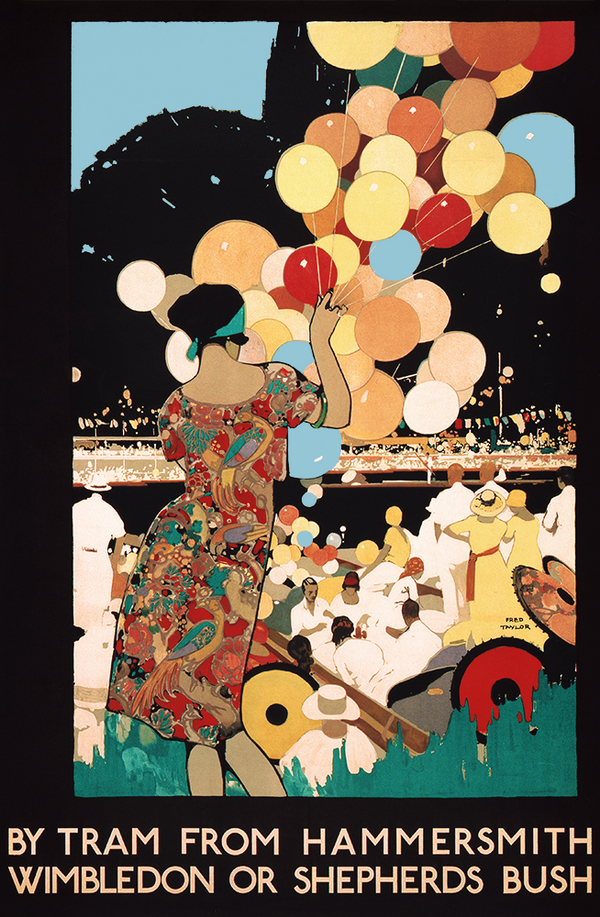
In season right now: delicious vintage art. We’ve already consumed our fair share of summer produce—a metric ton of tart cherries, sweet berries, fuzzy peaches, and Fourth-of-July watermelon—but our new edition is too typographically tasty to resist. Freshly picked by our curatorial team from the cornucopia of awesome art conceived of at the behest of the Works Projects Administration (WPA) between 1935-1943, Eat Fruit Be Healthy is an appetizing combo of luscious lettering and of-the-era image making.
There are stylistic suggestions of the tail end of Bauhaus and hints of art deco-esque elements to be found in this cherry-picked print. The fruit is simplified and stylized, their forms articulated through an expressive collection of graphic lines and shapes. The all-caps, negative-space lettering is bold, stretched, and buoyant. It’s a dynamic, exciting, engaging design—which makes sense when you consider the originating poster was a PSA encouraging people to pepper their diets with plenty of fruit, for optimal health.
Eat Fruit Be Healthy was created as part of the Federal Art Project (FAP), an arts-focused New Deal program sponsored by the WPA (one of the first U.S. government programs promoting the arts). The FAP employed thousands of artists and craftspeople during the Great Depression, and resulted in an astounding array of public art and over 30,000 poster designs—like the juicy (pun intended) piece we retouched and released today, and including a number of other awesome 20x200 Vintage Editions. The posters endorsed everything from community activities to public health. At the time Eat Fruit Be Healthy came into being, scientists had recently begun researching proper nutrition. As with many of the WPA posters, Eat Fruit Be Healthy’s straightforward message and specific imagery are a snapshot of a moment in American history.
Made in our fair NYC, Eat Fruit Be Healthy was originally a silkscreen print. When artist Anthony Velonis became head of the FAP’s graphic arts department, he introduced the studio to silk-screening. Believe it or not, every poster was painted by hand prior to his arrival. Silk-screening meant a major upgrade in efficiency, affordability, and control, making it possible to produce the posters on a larger scale and enabling artists to be more intimately involved with the production process as a whole—design and printing under one roof.
You might think of our Vintage Edition archival pigment prints as the next step in spreading savvy designs like Eat Fruit Be Healthy, creating another opportunity to share the work of the (often anonymous) Depression-era artists behind these pieces, and giving collectors a modern take on a more affordable option. Government-sustained artwork for the masses sure reminds us of our favorite motto: art for everyone. Snap it up ASAP. This museum-quality art harvest is low-hanging fruit.