This store requires javascript to be enabled for some features to work correctly.
Eye Test Chart

  • $85.00

SHIPPING FOR FRAMES ONLY AVAILABLE WITHIN U.S.

Add Custom Frame

SHIPPING FOR FRAMES ONLY AVAILABLE WITHIN U.S.

Add Custom Frame

SHIPPING FOR FRAMES ONLY AVAILABLE WITHIN U.S.

Add Custom Frame

SHIPPING FOR FRAMES ONLY AVAILABLE WITHIN U.S.

Add Custom Frame

SHIPPING FOR FRAMES ONLY AVAILABLE WITHIN U.S.

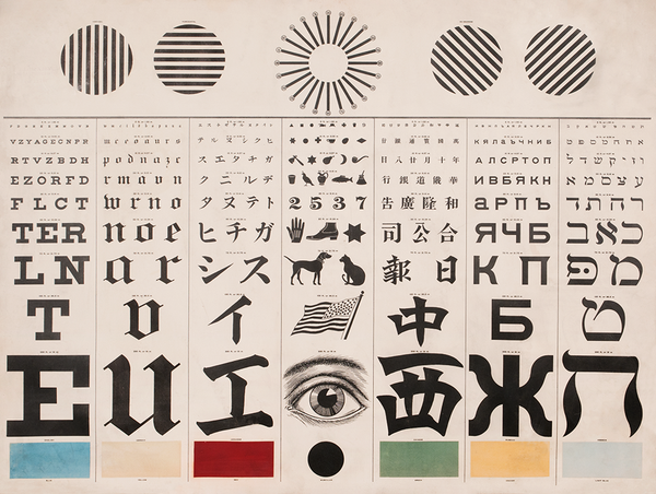
George Mayerle (1870-1929) created his Eye Test Chart in 1907 while working as an optician in the heart of San Francisco. The chart was marketed as the only tool “that can be used by people of any nationality”. At the time, San Francisco’s immigrant population was swiftly growing. Anticipating the difficulties of providing services to such a diverse community, Mayerle developed this chart to cater not only to multilingual patients but also to children and illiterate adults.


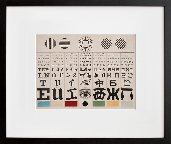
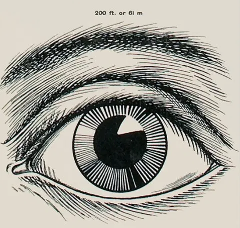
The Eye Test Chart combined four major subjective tests performed during an exam. The vertical panels that run through the center of the image tested visual acuity. These panels include two styles of the Roman alphabet for English-speaking and European readers, Japanese, Chinese, Russian, and Hebrew scripts. Additionally, Mayerle included a center panel consisting of non-alphabetic characters for those who were unable to read any of the other writing systems offered. Directly above these panels in the center is a radiant dial used for testing astigmatism, and flanking this on each side are four sets of lines used to measure the muscular strength of the eyes. Finally, six color swatches line the bottom of the chart for testing color vision, a feature marketed as specifically useful for the significant number of railway and steamboat workers in the city.

Created by optician George Mayerle in 1907, Eye Test Chart combines turn-of-the-century typography, diagnostic necessity, soothingly symmetrical design, and a progressive embrace of an ever-changing ethnic mosaic. While the image is beautifully balanced, it’s also intensely complex, each section, quadrant, and character equally capable of drawing the eye in. It’s a definite conversation starter, a journey that leads to new little discoveries the longer you look. The pictorial, centermost panel is almost hieroglyphic-like at first glance, giving Eye Test Chart the air of some sort of aesthetically appealing Rosetta Stone. But what’s really at work here is ingeniously intelligible and perfectly pragmatic ... Read more on the blog! 

+ Limited-edition, exclusive to 20x200
+ Museum quality: archival inks, 100% cotton rag paper unless noted
+ Handcrafted custom-framing is available

Our quoted dimensions are for the size of paper containing the images, not the printed image itself. We do not alter the aspect ratio, nor do we crop or resize the artists’ originals. All of our prints have a minimum border of .5 inches to allow for framing.

Museo Portfolio Rag

Edition Structure:
8"x10" | edition of 10
11"x14" | edition of 250
16"x20" | edition of 50
24"x30" | edition of 25