This store requires javascript to be enabled for some features to work correctly.

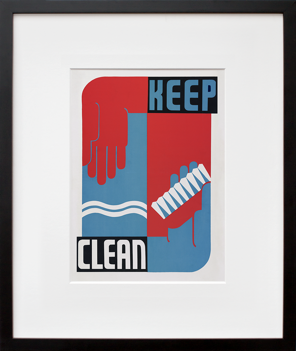
Keep clean

  • $85.00

Add Custom Frame

SHIPPING FOR FRAMES ONLY AVAILABLE WITHIN U.S.

Add Custom Frame

SHIPPING FOR FRAMES ONLY AVAILABLE WITHIN U.S.

Add Custom Frame

SHIPPING FOR FRAMES ONLY AVAILABLE WITHIN U.S.

Add Custom Frame

SHIPPING FOR FRAMES ONLY AVAILABLE WITHIN U.S.

Add Custom Frame

SHIPPING FOR FRAMES ONLY AVAILABLE WITHIN U.S.

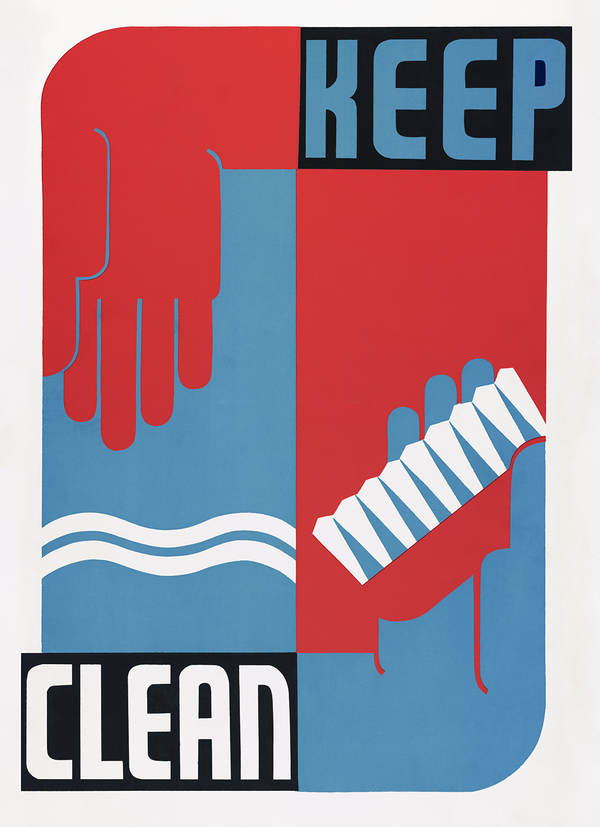
The Works Projects Administration (WPA) was established in 1935 as a government program designed to employ millions of job-seekers for public works projects with a goal of alleviating the economic effects of the Great Depression. This financial strain was compounded by a decline in sanitation and hygiene. In response, a number of government programs were created to improve public health and encourage cleanliness and nutrition. Keep clean was designed by Erik Hans Krause in the late 1930s as one of more than 30,000 poster designs created by artists working under the Federal Art Project (FAP)—a subset of the WPA—to promote community activities, positive social values, and proactive approaches to health. 


At the time, recent scientific advances in medicine revealed new information about how diseases spread and successful methods of prevention. Screenprinting was vital in disseminating this knowledge to ensure a safe and informed public. Today, as we live through a modern day pandemic, similar visual reminders have become commonplace, often with punchiness that parallels these original Bauhausian bulletins.

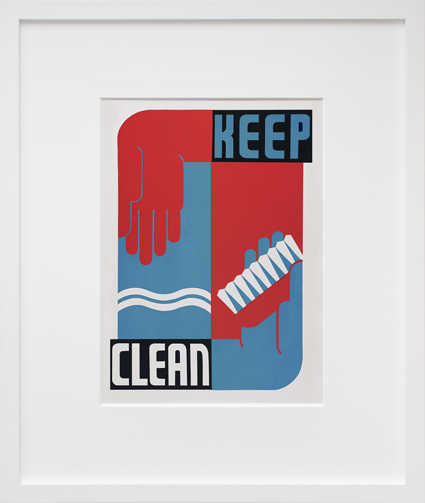
By now, we all know that regularly polishing those precious paws with soap and water is one of the best ways to help stop the spread of a virus, along with masking up and social distancing. A 20-second lather will set you right! Keep clean takes things to the next level with that stylized nail brush, a great way to really get up in there and slay some germs. The text is knocked out against black rectangles so it pops—an unmistakable imperative. The uppercase, sans-serif lettering is enthusiastic but unornamented, made of strong geometric forms. It’s Bauhausian in nature, emphasizing function over flourish, concentrated on clarity and communication. In the vein of Herbert Bayer’s Universal Alphabet, there’s idealism behind this typeface, an intention to make the art accessible, easily interpretable, and eminently publicizable. It’s no mistake the colors used are red, white, and blue. Keep clean is a clarion call for the American collective, a petition for self-protection that also benefits the public good. Hanging on your wall, it’s at once an encouraging reminder and a cool, graphic image to inject a little energy into your day ... Read more on the blog!

+ Limited-edition, exclusive to 20x200
+ Museum quality: archival inks, 100% cotton rag paper unless noted
+ Handcrafted custom-framing is available

Our quoted dimensions are for the size of paper containing the images, not the printed image itself. We do not alter the aspect ratio, nor do we crop or resize the artists’ originals. All of our prints have a minimum border of .5 inches to allow for framing.

Museo Portfolio Rag

Edition Structure:
10"x8" | edition of 10
14"x11" | edition of 200
20"x16" | edition of 25
24"x20" | edition of 10
40"x30" | edition of 2