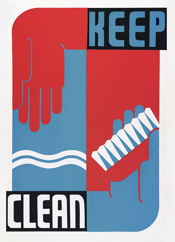
Keep clean, a 20x200 Vintage Edition
10"x8" ($35) | 14"x11" ($75) | 20"x16" ($260) | 24"x20" ($650) | 40"x30" ($1800)
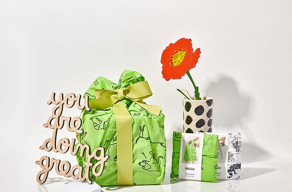
Collect this edition
We have to come clean. We can’t resist a well-timed release! Ergo, we’re rolling out this new Vintage Edition, Keep clean, as a preview to Global Handwashing Day this Thursday. (We’ve got something special slated for that day too, so stay tuned!) Last year, we didn’t even know Global Handwashing Day was a thing. This year, we’re washing our hands at every opportunity and feeling grateful for the folks out there extolling the science-backed benefits of good hand hygiene. In an appropriately appreciative manner, this 30s-era design makes routine mitt maintenance seem stylish, handsome, and, honestly, extremely enticing.
By now, we all know that regularly polishing those precious paws with soap and water is one of the best ways to help stop the spread of a virus, along with masking up and social distancing. A 20-second lather will set you right! Keep clean takes things to the next level with that stylized nail brush, a great way to really get up in there and slay some germs. The text is knocked out against black rectangles so it pops—an unmistakable imperative. The uppercase, sans-serif lettering is enthusiastic but unornamented, made of strong geometric forms. It’s Bauhausian in nature, emphasizing function over flourish, concentrated on clarity and communication. In the vein of Herbert Bayer’s Universal Alphabet, there’s idealism behind this typeface, an intention to make the art accessible, easily interpretable, and eminently publicizable. It’s no mistake the colors used are red, white, and blue. Keep clean is a clarion call for the American collective, a petition for self-protection that also benefits the public good. Hanging on your wall, it’s at once an encouraging reminder and a cool, graphic image to inject a little energy into your day.
Keep clean was made on behalf of the Works Progress Administration (WPA), an American New Deal agency devised to take the edge off Depression-era economic decline by enlisting job-seekers to tackle public works projects. A subset of the WPA called the Federal Art Project led to the creation of more than 30,000 artist-designed posters promoting community activities, positive social values, and proactive approaches to health. (We’ve remastered and released more than a few of these awesome designs as limited-edition prints over the years!) With widespread financial crisis, sanitation and hygiene suffered, particularly for the large swath of people newly plunged into poverty. At the same time, the scientific community had made recent strides in understanding the spread of disease and pinpointing methods of prevention. Keep clean was designed by Erik Hans Krause in the late 1930s to share this information with the American public, the message amplified through the supremely spreadable power of screenprinting.
Though it’s over 80 years old, Keep clean feels contemporary, and that’s as much a testament to its brilliant design as it is the simple, effective importance of solid hand hygiene. Over the last seven months in a modern day pandemic, we’ve found ourselves seeking out similarly bold visual verbalizations—pointed, punchy, motivating art to help us put one foot in front of the other. We’re picturing this in the bathroom, a kid’s room, the kitchen ... but it could really go anywhere. Collect yours and get to handwashing! Don’t tell TLC, but scrubs are encouraged.
With art for everyone,
Team 20x200