
Fair warning: this new 5+5 might send you on a deep scroll segue. Picking five (and a sneaky sixth!) fave 20x200 art pieces and answering five questions today is brilliant Brooklyn prop stylist Randi Brookman Harris. A visual storytelling savant, Brookman Harris has worked with The New York Times Magazine, Warby Parker, The New Yorker, Instagram, Sesame Street, Domino Magazine, Design Within Reach … honestly, there are too many impressive clients on her list to even scratch the surface. Check out her site or dive into her IG feed and you’ll see how easy it is to lose an hour to ogling her work.
Soothing, satisfying, energizing or otherwise entrancing, Brookman Harris’s tableaux are always transformative. With her exacting eye, incredible attention to detail, and playful touches, she has the power to elevate everyday objects like ballpoint pens, cigarette butts and bobby pins into elements of art, eliciting mood and emotion along the way. Each item and its placement is carefully considered. Composition, negative space, contrast, balance and a sort of wabi-sabi beauty are all brandished with an insane amount of artistry to create particular, persuasive narratives. Brookman Harris makes eye candy for a living, and we’re happy to gorge.
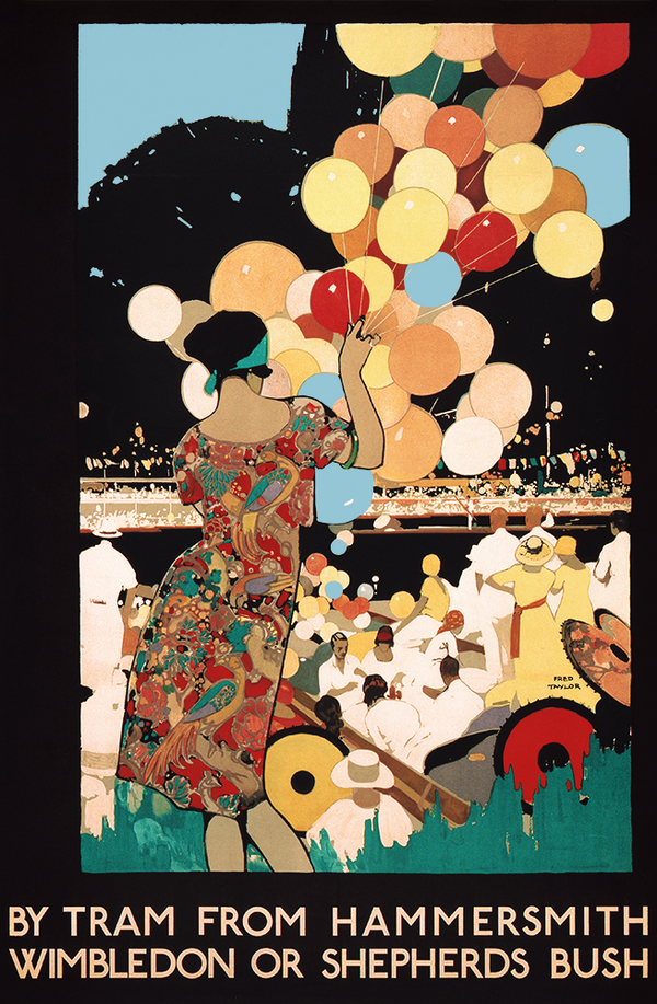
It’s no surprise that she approached her 5+5 art picks with the same curatorial punctiliousness that she brings to her still life styling, designing the arrangement of pieces so they’re in harmony and inform each other as much as they speak to her on an individual basis. Her edition mix is a work of art in and of itself, so much so that we simply had to include her extra sixth select. (BTW, this combo would make a killer gallery wall.) Get her thoughts on the shapes, textures, and typography that drew her to these prints, how she got into her line of work, and so much more. — Team 20x200
5 Perfect Picks
|
|
1) Hershey's Kisses by Andrew Miller I love when all color is unified tonally in three dimensional objects, revealing just the texture. I especially love the simplicity it allows in seeing something so iconic, stripping away all the unnecessary things we know about a Hershey's Kiss (the sparkle of the foil, the blue branding on the flag...) but keeping it the same amount of recognizable as it would have been had those been there — with the air around it, not knowing where the space begins or ends, and the loneliness of a single kiss. it just feels like so much in such a small whisper. |
 |
2) Rocks at The American Museum of Natural History by Jason Polan I love Jason Polan's style, his work, his brain, his curious appetite for people and things to draw, and in turn how he was with people and friends alike — a refreshing human quality I found exciting both when he was alive and in the way people remembered him in his passing. The minerals and gems exhibit at the AMNH is one of my favorite exhibits in the city. I love how color and sparkle are gone from this glossary — the distillation of the variety of just shapes and texture, with handwritten labeling, feels almost more abundant than if those were present, just because of how much care for the lowly rocks Jason gave them. In some ways, this work does the same thing conceptually that I describe loving of Andrew Miller's Hershey's Kisses above! |
 |
3) All the Past and Futures by Valerie Roybal Collage is always so interesting to me when done seamlessly and elevated — and in this case, without any differentiation of color and the draining of contrast, all the elements look flattened in a way, like they come from the same place or like they could have existed in this composition naturally without any human hand. I love how organic the shapes and their arrangement are, and how asymmetrical the composition is. So thoughtful and lovely, beckoning us to study it closer, my favorite thing about art. |
 |
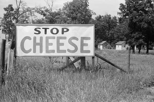
4) Georgia road sign by Dorothea Lange I love the ratio of grass to sky in the framing of this photo and the slightly slumped horizon. It feels relaxing like landscapes are wont to do. But also like a funny-yet-serious joke for it to have a jauntily-placed hand-painted sign that says "Hambuglars". Like, did someone not know how to spell Hamburgers? Did no one fact-check before painting and installing the sign? Did they just not want to deal with correcting it once it was up? I have more questions than answers and usually that feels unsettling in art and life for me, but in this case I just feel like Dorothea Lange got it and did it justice. And probably laughed while capturing it. |
 |
5) Blizzard by William Wegman I have styled confetti more than I wish I would have, and it is NOT EASY to make it look so effortless. I think aside from my love of dogs, and my love of Wegman's expressive Weimaraners (and their beautiful greige-y fur), and my love of confetti (in my work solely, definitely not in real life!) I'm most drawn to the process here... Like, how many takes did Wegman do? How many studio assistants did he have to clean it up and toss it over and over? How did they get it not to clump? How did he get train his dog to stay so well?!?! Was there a fan? Who made the confetti and what was the material? Was the set black velvet? I Just want to get behind the scenes so so badly! But ultimately I think it is such a beautiful composition — almost black and white but not quite, with tone and texture working so well. |
 |
BONUS!) Blossom Restaurant, The Bowery by Berenice Abbott For me, the icing on the cake of my above 5 selections of black and white pieces is this bonus addition of typographic texture (so many kinds! handwritten! sign lettering! machine printed! Plus that little fun bit of diagonal striping!) As a former graphic designer and type nerd, I LOVE this piece on its own for just that. As a stylist, I love this piece for it's surprise elements when you look closer and how they all work together — the bored lady peeking out from the barber pole, the angles of the man's lapels and tie juxtaposed with the angles of the barber pole striping, the glass grid sidewalk lights to the cellars below, the single round globe lamp, the high contrast of all the various textures — it's got it all! But I love the way it adds urban, historical gravitas and graphic contrast to the other elements of my selections — rural landscape, line drawing, abundant glossary, singular simplicity, organic shape collage, and animal/still life! |

5 Q's + 5 A's
1) What's your favorite museum?
I really love the Whitney. The way the architecture feels expansive and unfussy makes for very highly focused art viewing and ruminating for me. Confusing surroundings make for distracted experiencing for my ADHD brain. The easy navigating of the space there helps me to have these really exciting anticipatory experiences interacting with the art and how it enters my psyche. The ability to return over and over has been really rewarding, like a favorite jacket you remember how much you love every fall when you take it out of the closet.
2) What's your most coveted coffee table book?
I have a Marcel Duchamp coffee table book that I forever-borrowed from my Gramma's house when I was 4 or 5. I looked at it all the time. I was always trying to figure out what the heck I was looking at! Dada both makes so much sense and no sense at all to a small child and that push-pull had me hooked. I probably spent a hundred hours of my life studying it before I ever went to art school. It made me love and embrace weirdness and quirk as visual currency I think.
3) Do you prefer a single statement piece or a salon wall?
Salon wall.
4) You've got $5m you have to spend on one piece of art. What would it be?
The Claes Oldenburg sandwich with an olive on top.
5) Perusing your portfolio, there's one thing that's impossible not to appreciate: prop styling is an art form! How did you get into this field?
I got a formal Graphic Design education to satisfy my curiosity and needs at that point in my life. It definitely trained me to trust in the way I see and I gained a lot of foundational understanding and made some important connections. But my eye is my eye and it always was. I just didn't have the faith in it at that young age to know I could use it in any way I wanted to without someone telling me I was qualified. I had sensed that my love affair with Graphic Design as a concept had run its course in me and that I wasn't fit for the professional day-to-day aspects of it as a job. My need to create quickly and also so slowly (i.e. on my own time — which was the ADHD that was diagnosed *way* later) always had me feeling like I couldn't quite sit at the computer and solve typographic problems all day long. Working with my hands, sculpting and creating assemblages, crafting, ideating, rearranging shelves, knickknacks and furniture always scratched a big itch for me so when I learned that Prop Styling was a job I was ecstatic! It felt like a dream! I was ready to dive right in and do anything it took —I was handed some major lucky strokes that let me just do it right then with very little obstruction that I constantly think about how I can pay forward to young and aspiring talents who have the passion and drive to do this offbeat artsy job, too.
The 411 on Randi Brookman Harris
I tell stories with stuff. Working with a wide array of brands, publications, and media companies, I always bring the same exacting eye, sense of humor, obsession with detail, and spot-on storytelling to every project I do. Human connection is the element I've always sought to create within still life styling -- storytelling to draw out meaning or wit or love or longing from the traces left behind by a protagonist. Understanding humanity in a broad way more and more everyday over the course of my life has made me both more interested in my work and less interested in my job. Sometimes I can't tell which! I love to spend my time cooking and caring for people and my dog. I'd take a day at a museum, the beach, or hiking in the woods over work any day of the week.
Site: brookmanharris.com Instagram: @randibrookmanharris