If you’ve ever painted your own walls, you know the struggle is real, and that much of that struggle plays out before you even pop open a paint can. One trip to Home Depot on the swatch hunt is enough to scar a wannabe wall painter for life. Too many seemingly identical options, a billion different brands, and a whole lotta mysterious verbiage. That’s where Clare comes in. Interior designer Nicole Gibbons launched the direct-to-consumer paint line in 2018, making it way easier for folks to experience the magic of a fresh coat of color. We wanna make it possible for more people to be able to—and to enjoy—collecting art, so we’re totally on board with Clare’s mission to refresh what should be a fun and accessible home improvement activity. Live with art, and hang that art on beautiful walls while you’re at it.
Need some direction? The Clare Color Genius quizzes you on your current space and lighting sitch, your style, and the vibe you’re going for, then proposes a few on-point hues. The first three color samples are free, and they arrive in (genius!) peel-and-stick form. But for all their color savvy, Clare doesn’t skimp on quality. All of their 100% acrylic, low-odor, zero VOC paints are GreenGuard Gold–certified. Plus, they’ll stand up to all sorts of abuse. (Mildew, meet your match.)
Wall color—like art—can totally transform a space, and with it, your mood, the moment, the whole dang day. Clare's carefully curated selection of 55 expert-approved shades will keep the decision fatigue at bay. When we tapped Gibbons for a 5+5, we should have guessed her art picks would be color-popping. In fact, the mix she selected is basically a stylish salon wall starter pack. — Team 20x200
5 Perfect Picks
 1) Praia Piquinia 02/08/07 15h16 by Christian Chaize
This is the actual Christian Chaize print I have that I got on 20x200! This is the first print I ever bought on the site. I love beach landscapes—they make me feel calmer just looking at them and since this beautiful beach is a far cry away from NYC, there's a feeling of escapism when I look at this.
 2) Flamingo No. 4 by Sharon Montrose
I really love this artist's work and there is something very elegant about a flamingo. I think this piece adds a whimsical touch and pop of color into a room.
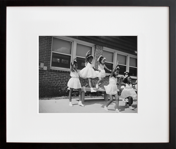
 3) Harlem Tenement in Summer, a 20x200 Vintage Edition
I lived in Harlem for 15 years. 11 of them were in a classic Harlem tenement building. Even though I'm on the UWS now, Harlem is still very much home and I love seeing glimpses of Harlem in the heyday of the Renaissance and the idea that people still congregate on their stoops in the same fashion today—100 years later!
 4) Day 256: Vintage Airline Tags by Lisa Congdon
I absolutely love to travel and was drawn to this piece immediately! I love the vintage travel tags and how they each tell a story. I also love the variety of colors used. This would be a great piece for a gallery wall!
 5) Full-time Feminist by Western Editions
I really enjoy mixing different types of artwork and appreciate pieces that make a statement. This is a great piece for a gallery wall, and a piece that shows your beliefs. I also love the colors used here.
5 Q's + 5 A's
1) What's your favorite museum?
The Metropolitan Museum of Art is my favorite. I’m fascinated by history and I love the Egyptian section. I love getting lost in architecture, seeing all of the relics and learning the history behind them. I could spend hours there!
2) What's your most coveted coffee table book?
I don't have a favorite! I have so many and actually collect them. Most of them are design focused and right now, I really love Kelly Wearstler’s book- her style and use of color is incredible and so inspiring to flip through.
3) Do you prefer a single statement piece or a salon wall?
It depends on the space! I would likely choose a statement piece. Depending on your space and design aesthetic, gallery walls are also a great option and way to create a focal point in a room.
4) You've got $5m you have to spend on one piece of art. What would it be?
I would choose something from Malick Sidibe. I love art that depicts people in everyday life and his photographs are amazing!
5) Here at 20x200, we're big fans of a gray wall as a backdrop for art. What colors, techniques or tips would you suggest when it comes to choosing a paint color to compliment an art collection?
A rich paint color like Current Mood lets the artwork really shine. But opt for unexpected juxtaposition. While a dark color might seem hard to coordinate with, it pairs surprisingly well with black and white, while contrasting nicely with vibrant, warm tones. But if you have really colorful artwork, a white wall could balance it out too.
The 411 on Nicole Gibbons Nicole Gibbons is the entrepreneur that has completely disrupted the $155B global paint industry with Clare, the first-ever direct-to-consumer paint brand with an innovative business model that takes the pain out of paint. Nicole spent more than a decade working in the fashion industry, serving as a PR executive at a major global retail brand before turning her side hustle into a full-time interior design business as an interior designer and on-air personality for networks like HGTV, The Rachael Ray Show, and the Emmy Award-winning Home Made Simple on OWN, the Oprah Winfrey Network.
In 2016 Nicole had a lightbulb moment - the paint shopping process is overcomplicated, overwhelming, and lacks innovation. In 2017, Nicole became 1 of just 34 black female entrepreneurs in the U.S. to surpass the million mark in capital fundraising, an accomplishment she met with $2M in seed funding from prominent VC investors such as Imaginary Ventures (Net A Porter founder Natalie Massenet’s firm), First Round Capital, the co-founders of Casper, and the co-founders of Harry’s. With an army of supporters, Nicole launched Clare in July 2018. The success of her business has turned heads in both business and design, receiving praise from the likes of Forbes, Business Insider, Fast Company, Architectural Digest, + more.
Site: Nicole Gibbons Instagram: @nicolegibbonsstyle Twitter: @NicoleGibbons

