


There are as many styles of illustration as there are things to illustrate. Beyond any one artist’s individual signature exists the genre, culture, and prevailing trends in which they’re working. Illustration is, after all, a call-and-response process designed to more kaleidoscopically transmit the idea behind something, whether that idea springs from a story being told or goods, services or behaviors being promoted. How the illustration is produced, read and received has historically been highly influenced by how the perceiver is projected to react to it–its effectiveness often sinks or swims in a flash. Below are a few of our favorite editions from the illustrative world—we couldn't fit them all, so read further on our blog!

The Art Nouveau style in which Dig was designed by Sadie Wendell Mitchell was not solely an aesthetic choice. Hiding a deeply feminist and subversive (for the time and…also now?) message in the prevailing visual language of the time was a smart choice. Originally designed as a postcard in 1909, Mitchell created Dig as part of her Girls Will Be Girls series, promoting women’s literacy and education. Note the only three named titles in the piece: “Economy”, “The Psychology of the Male Human” and “The Study of Bugology”—a coincidence? We think not. A sign above reads “DO IT NOW”, a nod to Mitchell’s dedicated activism around women’s education.

Julia Rothman walks around New York City collecting photos of everyday scenes she encounters. This painting is based on a photograph she took at the Whitney Museum earlier that day, looking down from a balcony at the clusters of visitors. She has a delightfully personal, off-the-cuff style: rendering her subjects with loose linework and blocks of color, she’s playful with the image’s perspective (yet somehow spot-on at the same time) and selective with her palette. Despite being stylized, this image just feels honest, and she drew it for the sake of drawing it. Her world is all around her, and all of it is worth illustrating.

Typical Cows, a 20x200 Vintage Edition
Is any cow a typical cow? Published by Nature & Method Publishing Company in 1904, this educational illustration depicts four common dairy cows of the time: Holstein, Ayrshire, Jersey, and shorthorn. At the turn of the 20th century, illustrations such as this were not only beautiful, but created for educational purposes. Sure, you can read a description of what the spots on an Ayrshire look like, but isn’t it more effective to see for yourself?

Drawn in 1894 by 19th c. English illustrator Aubrey Beardsley, The Black Cat served as a sinister companion to Edgar Allen Poe’s story of the same name. In the grim tale, the narrator mistakenly walls up the furious cat with the corpse of his wife. Beardsley’s The Black Cat features the moment a wall is broken through, revealing the fierce one-eyed feline balanced atop the dead woman’s head. The crazed creature is rendered in fine white linework, blending almost completely with the solid black darkness of the inner wall with the exception of his single searing eye. His deceased perch is flatly white, economically delineated by eerily light penwork. Beardsley was an iconoclast, to say the least, and was (and remains) wildly popular precisely because nobody drew like he did.

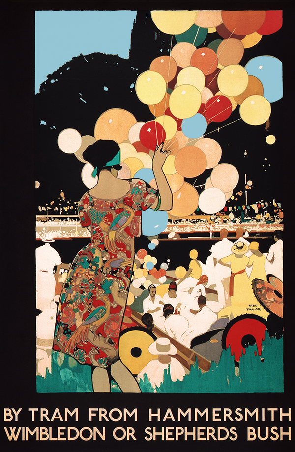
This piece, our newest release, is a vibrant illustration c.1910-1920 that includes many seemingly disparate visual motifs. The garland of electric blooms and high-chroma ovular shapes encircling the girlish subject don’t only impart sinuous motion to the piece–they look to the modern eye like something directly out of Takashi Murakami’s mind, but filtered through the decorative lens of Gustav Klimt. The posture of the figure’s arms, hands, and shoulders, however, are pure classic French fashion illustration. This type of image falls under the umbrella of the “fashion plate”—not the crayon-rubbing plastic toy of the 70s and 80s, but a typical categorical method of depicting and disseminating information about the hottest and newest outfits that were dans le style.

Shortly into his presidency, Franklin D. Roosevelt established the Civilian Conservation Corps, focused both on providing jobs to unemployed Americans and helping a young National Park Service preserve and upgrade the national parks. The Works Progress Administration—another group formed in FDR’s New Deal—offered the services of their artists to spread the word that the parks were ready for visitors. Between 1938 and 1941, the WPA designed 14 silkscreened promotional posters. Of those 14 original designs, only 12 have been recovered—including this pastel Grand Canyon poster. The clean, blocky design and limited palette served to make silkscreen reproduction–the newest and fastest method at the time of creating large volumes of posters–possible.