
Eye Test Chart by George Mayerle
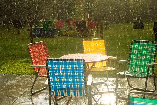
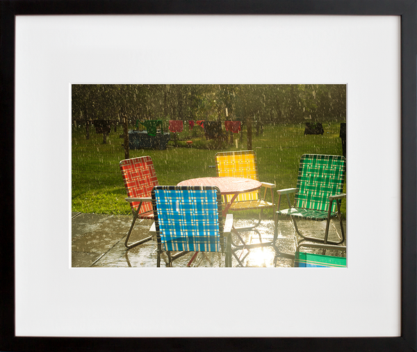
Update from affordable art land: we wanna get prints in your paws. As we hustle to find ways to safely, gradually get things going again, it’s given us a new appreciation for the meticulous print production process that's usually (see: not during pandemic times) part of our every day. We've talked a bit about that process before. A lot of effort goes into each one of our limited-editions, but man, it’s a labor of love. We miss making print magic happen!
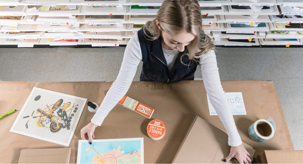
To shed some light on all the work that goes into getting one of our archival pigment prints juuuuust right, we caught up with our retoucher Emma Ressel. A fine art photographer herself, Emma brings her unique skill set and an expert eye to the table when she’s retouching edition images and proofing prints. New on the blog today, she talks us through the printmaking process—from image restoration and material research through quality control and artist communication. Emma works closely with our printer, a master in his craft who’s been doing his thing in NYC for over two decades. She fills us in on what that collaboration looks like. Plus, she spills re: what makes our museum-quality prints so special. All juicy info for artists, collectors, and anyone interested in peeking behind the scenes. — Team 20x200
What’s your expertise? How did you come to be involved in image restoration and printmaking?
I studied photography in college, and a big part of my education was developing film and making prints in the darkroom, as well as editing images in photoshop and making inkjet prints from scanned negatives. Starting out in the darkroom gave me a good foundational knowledge of how photographs and prints work on a chemical level, and I keep the analog principles about color and contrast in mind as I work with images in photoshop. I have experience working in galleries and assisting artists directly with making prints, and I am a photographer myself, so an important part of my work is staying up to date with the best materials, equipment, and techniques for making fine art inkjet prints.
Walk us through your process. What’s your work involve, and what principles guide your retouching practice and the image enhancement techniques you use?
I work with 20x200 to essentially translate each new artwork that has been selected for an edition from a file on the computer to a print that looks as true to the artwork as possible. I start with a raw scan, which comes to us directly from either an artist or a collection. I make incredibly subtle adjustments to the file in Photoshop to get it looking as clean, refined, and as close to the original artwork as possible. First, I retouch away distracting imperfections from the scanning process, including dust, smudges, and creases. Then, I balance out all the colors, and finally, I tinker with the highlights and shadows to get the perfect amount of contrast and pop. Once we all agree the file is looking great on the screen, then I take it to the lab to make the proof prints.
How do you and the team approach images from contemporary artists to make sure the final print is in line with the artist’s intentions?
In working on an artwork by a contemporary artist, the notable part of the process is the constant communication with the artist at each stage of the retouching and printing process. Once I retouch an artist’s file, we send it to the artist for their approval before moving onto the next step. Often, the artist is able to provide a “match” file I can reference so I can get a sense of how to interpret their specific use of color and contrast correctly. Once we create the proof prints, we send one to the artist for them to see the print in person and get their sign of approval before the edition goes live on the site. We do this as many times as necessary to get the print looking perfect! Communicating with the artists along the way is one of my favorite parts of the process, because it is so interesting to get a little window into how they each think about their prints. It’s a cliche, but each artist really does have such a different process.
 Raw photo of Caitlin Parker's fabric cyanotype |
 Catskill Prairie by Caitlin Parker |
How does that differ when it comes to 20x200’s Vintage or Space Editions?
When I work with vintage pieces, I find myself thinking a lot about the materiality of the original artwork that we are reproducing, and what I can do to stay as true to the original as possible. The vintage pieces can be oil paintings, graphite sketches, collages, woodblocks, and more, all in varying levels of condition, and all with different textural qualities and color schemes. With these pieces, I bring a bit more of my own artistic eye to the table, and we focus on achieving a certain feeling with the artwork.
Talk to us about working with 20x200’s fine art printer. How do you collaborate to perfect our archival pigment prints for production?
It might just be me, but there is something exhilarating about looking at a warm print, fresh out of the printer. I guess it’s not unlike eating a warm bagel, fresh out of the oven! Our master printer works from computers with specially calibrated screens that are designed to display the images in a way that makes them appear closer to a physical print. The printers themselves are big machines that can produce prints up to 60” wide. When I bring the files to his lab, we first look at the file together on his special screens and make preliminary adjustments. He then starts running 8x10 test prints, and we adjust elements of the image as necessary. Our printer has an incredible eye, and it is fun to totally geek out about color and contrast and have discussions about how to push and pull the file to get it just right. It’s so funny— some pieces need hardly any adjustments at all, and some are more finicky and challenging to get just right!
What’s the difference between 20x200’s museum-quality prints, and posters or other inkjet prints?
The “top-tier” papers we use are incredibly high quality, durable, and beautiful papers that have been carefully selected for each artwork. So many posters and other inkjet prints out there are made with flimsy, economy papers that ripple, fade, or curl over time, but 20x200 prints are made on archival papers that have been designed to last, when kept in good condition, for over 100 years! These are the same papers that contemporary artists are using for the highest profile museum and gallery exhibitions. The other remarkable thing about 20x200 prints is that they have gone through so many rounds of QCing before reaching their final destination. When the print arrives at your home, it has been approved by the artist, QCd by the 20x200 team, myself, our master printer, and in a lot of cases, also our framing team. The quality of the print simply could not be higher!
The 411 on Emma Ressel Emma Ressel (b. Bar Harbor, Maine) is a fine-art photographer who creates surreal still life photographs of food. She challenges pure aesthetic pleasure through surprising compositions that are unafraid to depict rot, nonsensical combinations of ingredients, and vague, undefined stories.
Ressel has exhibited widely across the east coast and internationally. In 2019 she had a solo show of new work at Colorspace Labs, Philadelphia PA, and a three person show at The Vermont Center for Photography. In 2018 she had a solo show, Olives in the street, at Woods Gallery at Bard College. Her work has been exhibited in numerous group shows in galleries including Fotonostrum Gallery, Barcelona Spain; Red Hook Labs, Brooklyn NY; September Gallery, Hudson NY; Godine Family Gallery, Boston MA; Lucas Lucas Gallery, Brooklyn NY; Site: Brooklyn, Brooklyn NY; The Wing DC and The Wing Soho; and Artemis Gallery, Northeast Harbor ME; among others. She was the winner of the 13th Pollux Award in the Still Life Category and won the Stinnett Philadelphia Museum of Art Collection Award in The Print Center's 92nd Annual International Competition.
Ressel’s first monograph, Olives in the street, was published by Edizione del bradipo and sold out in 2017. A second edition was released in 2018. Ressel received a BA in Photography from Bard College, where she was awarded the Photography Advisory Board Scholarship, the Photography Senior Project Prize, and the Bard LugoLand Residency Prize. She has been featured in the New York Times Magazine and New York Magazine and her work is found in the permanent collection of the Philadelphia Museum of Art. She lives and works in Brooklyn, NY.
Site: emmaressel.com Instagram: @emma.ressel