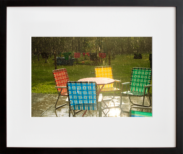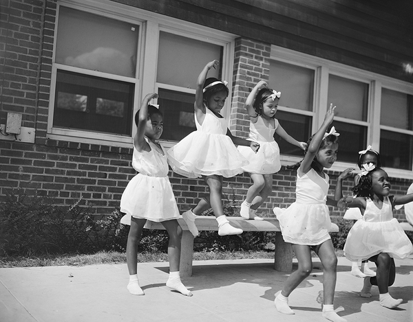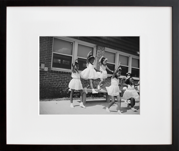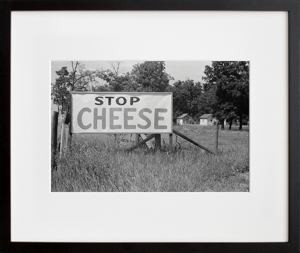
Our new favorite form of procrastination can definitely be blamed on the recent influx of inside time. In a predictably topical turn of events, we’ve found ourselves filling our personal feeds with shelter mag porn, salivating over sophisticated living spaces and enviable interiors. On the one hand, it’s satisfyingly escapist, but on the other it’s inspiring, giving us all sorts of ideas for how we might rethink our work-from-home headquarters with what we’ve got on hand. (BRB, rearranging an end table.)
Among the aspirational images we’ve been ogling is the portfolio of Manhattan-based boutique design firm Dufner Heighes. Longtime friends of 20x200, Greg Dufner and Daniel Heighes Wismer apply a comprehensive approach to creating their stunning spaces, overseeing the architecture, interior design, and decorating. This triple threat tactic (for which the two are uniquely talented) results in extraordinary cohesion, flow, and finesse. Working collaboratively with their clients, they employ personality, style, and livable ease in equal measure. Their vibe tends toward neutral tones and airy, modern atmospheres punctuated by tastefully bold, unexpected touches that add excitement without overwhelming the refined aesthetic. It’s an elegant balancing act, and one that makes their projects particularly refreshing daydream fodder.
Another standout quality of their practice: There’s carefully chosen art in every room—not added on last minute but springing from and central to the soul of the space. Which is why we knew they’d have some wildly good art recs and hot takes for today’s 5+5 feature. — Team 20x200
5 Perfect Picks
 1) The Ten Largest, No. 6, Adulthood, Group IV by Hilma af Klint
This series of work is fascinating as windows into another realm. The palette here is feminine, bold and enigmatic. It would be at home in a private, contemplative space like a bedroom or study where the multiple meanings and moods can be experienced with repeated exposures.
 2) The Tetons, Snake River by Ansel Adams
This is a classic, iconic image that works equally well in both traditional and modern spaces. We love the crisp contrast of the black and white tones. Everyone relates to the vast expanses and natural majesty that Ansel Adams evokes.
 3) Untitled (a) by Kindah Khalidy
We are drawn to this work for its use of graphic symbols and bold color. The symbolic nature of the image tells multiple stories, depending on the viewer. Its energetic and youthful. It would bring sophistication to a kid’s room or play space, but also still speak to the adults around. It would also bring life to a grouping of works on a larger wall.
 4) Corner Cafe by Jorge Colombo
We love this use of technology to capture a true New York moment, but also that the image ultimately transcends the technology. We recently hung this work in a project with a black mat and a black frame with a focused light. The colors of the neon and crosswalk pop off the wall.
 5) Green Branches by Tod Seelie
This image is a celebration of beauty in the unexpected. We love the muted color palette and juxtaposition of nature and architecture. We’ve used this work in two very different projects and both clients were very happy with the results. It’s a great way to bring texture and warmth into even the most modern space.
5 Q's + 5 A's
1) What's your favorite museum?
The Guggenheim New York. Its both an iconic space and it has a rigorous exhibition calendar. The mix of timely art historical reconsiderations combined with of-the-moment contemporary works is inspiring and invigorating for us. The space itself feels so intimate along the ramps with the relief of the full exhibition across the full rotunda. It’s the best space in New York.
2) What's your most coveted coffee table book?
“Finn Juhl and His House” by Per H. Hansen is an in-depth exploration of the balance between art, interior design and architecture in the master Danish furniture designer’s home outside Copenhagen. It’s everything we try to do for our clients.
3) Do you prefer a single statement piece or a salon wall?
Both! Luckily, all rooms have more than one wall so you don't have to choose! We love over-scaled statement pieces in smaller rooms so that you can really feel inside the frame and groups of work hung on large walls to slow down the experience of a grand space.
4) You've got $5m you have to spend on one piece of art. What would it be?
Any painting by Gerhard Richter.
5) One of the things we find most impressive about your design portfolio is the way you integrate interesting, unusual art into your projects. How do you get a client who's not already an art collector on board with the idea of making art an essential part of the plan?
It is a long process. It’s all about education. We always have art images in even our most schematic design presentations. Even if the client hates a work, that tells us as much as if they love it. From images, we move onto visiting art fairs and auctions later in the design phase. There are a million fairs in every location and budget, so they are a great way to see a lot of work. It’s a Rorschach test for our clients. It involves looking at a lot of work to see what their interests are. Most clients like works that tell a story so that they can feel a deeper connection than just the image. Ultimately, showing a client the work in their space is most impactful and they understand the transformative nature of living with art.
The 411 on Dufner Heighes Dufner Heighes creates timeless residences and welcoming commercial interiors for a sophisticated cosmopolitan clientele. Our luxurious modern designs blend subtle proportions with a thoughtful color palette of neutrals sparked with precious elements like platinum brick and honed Portoro marble. Unexpected textures and geometries balance function, for personalized environments that convey a sense of time and place.
We collaborate closely with our clients to integrate architecture and interiors. Over the last two decades, Dufner Heighes has completed countless apartments in New York and luxury homes from Vermont to California.
Our work has graced the covers of Interior Design, Metropolitan Home and Luxe magazines, and stories about our work have appeared in Architectural Digest, Martha Stewart Living and The New York Times. Dufner Heighes was among “The Up-and-Comers” in Departures, the magazine of American Express platinum members, and we were included in Metropolitan Home magazine’s Design 100.
Site: dufnerheighes.com Instagram: @dufnerheighes

