Is "bestie aspiration” a thing? Because that’s pretty much how we’d describe our feels for award-winning editor and Brooklyn cool mom, Lexi Mainland. As managing editor of Cup of Jo, one of the most passionately buzzed about women’s lifestyle sites (and prime lunchtime reading material for team 20x200), Mainland covers everything from styling tips and homemade pasta to mental health and motherhood. The breadth, authenticity and thoughtfulness of Cup of Jo’s features is part of what appeals to audiences like us. In all the white noise of the internet, the site speaks to a genuine, complex human experience, and is endlessly entertaining to boot.
Before joining the Cup of Jo team, Mainland spent nine years as an editor at The New York Times, where she secured the publication’s first-ever Emmy for a photo-based series called One in 8 Million—profiles of 54 of the 8 million people living in NYC in 2009. Beyond her indisputable editorial talent, Mainland clearly has a visual bent. Her love of art and design (and obvious knack for organizing) mean her home decor style is seriously drool-worthy. We would all like to move in immediately, please. But until we get the invite we’re happy knowing that more than a few 20x200 editions have made themselves at home in her apartment. May we live vicariously through them.
A few things we learned from this Q+A: she really digs the moody vibes of Dutch Golden Age paintings, heavily cosigns wee, wearable art, and has some excellent pro tips for picking out art for a kid’s room. Read on! – Jen Bekman + Team 20x200
5 Perfect Picks
1) Flowers in a Glass Bowl by Rachel Ruysch
I've always loved the still life flower paintings of the Dutch Golden Age (Vermeer's make my heart swell.) They're brooding and dark at the same time as being delicate and detailed. A print like this would make it feel like you always had fresh flowers at home. Most of the paintings I've seen from this period are by men, but this beautiful one is by a 17th Century female painter.
2) Planetary Mobile by Kelli Anderson
PSA: Mobiles aren't just for babies! What a cool piece of sculpture to hang in an unexpected place, like over a chair in a peaceful reading corner.
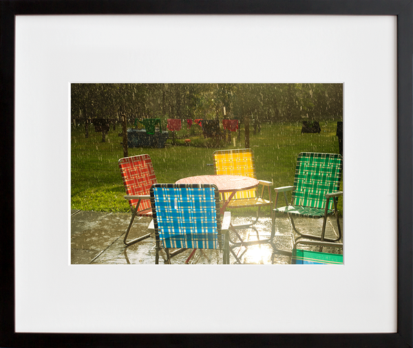
3) The Storm is Coming by Tom Kondrat
I have this piece on a gallery wall at home. The colors are so rich in person and there's tons of texture -- friends always ask if it's a painting. Also, I adore the seascape photos of Hiroshi Sugimoto and this has a similar vibe.
4) Book Pins by Jane Mount
I can't think of a better gift for a bookworm's jean jacket. All of the pins in this collection are one square inch of pure delight.
5) Views of the extravehicular activity during STS 41-B, a 20x200 Space Edition
If I had this print on my wall I think it would really help me keep things in perspective! Earth: Awe-inspiring. Humans: Amazing but minuscule in comparison.
5 Q's + 5 A's
1) What's your favorite museum?
The Storm King Art Center in the Hudson Valley, in sweater weather. You crunch your way through a carpet of autumn leaves -- usually with nobody else around -- and come upon Andy Goldsworthy's biggest-ever piece snaking through the woods. Incredible.
2) What's your most coveted coffee table book?
When I first started to get into photography in high school I found my way to buying The Americans, a classic collection of black-and-white Robert Frank photos published in 1958. It's come along with me everywhere I've lived since then and it never gets old for me.
3) If you could be reincarnated as an artist, who would you want to be?
Sarah Sze, who makes these elaborate sculptures using all sorts of everyday objects like ladders, extension cords and Q-tips. She's like an artistic MacGyver; it would be so fun to make stuff like that.
4) Do you prefer a single statement piece or a salon wall?
Hard call! I love a single statement piece because it's the perfect combination of minimalism and maximalism.
5) You recently welcomed your second little one into the fam. Mazel tov! Cup of Jo is such a great resource for design inspo—what are your insider tips for arting-out a kid's nook or nursery?
Thank you! Picking out artwork for my kids' rooms has been my favorite part of decorating a family home. My approach is to take some of the enduring themes of kids' rooms, like animals or alphabets and look for sophisticated or even slightly edgy interpretations of those themes that could stay with them throughout their lives. For example, I am completely obsessed with these Luke Stephenson lovebirds. How sweet would they be in a kid's room? But they'd totally work in a grown-up apartment, too. Or these Wegman letters will become collectors' pieces (O for my new baby daughter Olympia.) One of my favorite new pieces for my four-year-old son's room is this poster, which is a bit sarcastic but the simple graphic/alphabet aspect of it totally works for a kid's room.
The 411 on Lexi Mainland
Lexi is a Brooklyn-based mom of two and a lover of art and design with absolutely zero DIY skills. Also, not for lack of trying, she has a black thumb. Her home is where plants sadly come to die. For the past three years she's helped run the women's lifestyle site Cup of Jo, and before that she spent nine years as an editor at The New York Times (I won NYT's first-ever Emmy for creating a photography-based series called One in 8 Million) and six as a documentary producer at PBS.
Site: Cup of Jo Twitter: @lexim Instagram: @leximainland Facebook: @lexim Pinterest: @leximainland
Read the prior 5+5 with plant purveryor and NYC business boss Eliza Blank »

